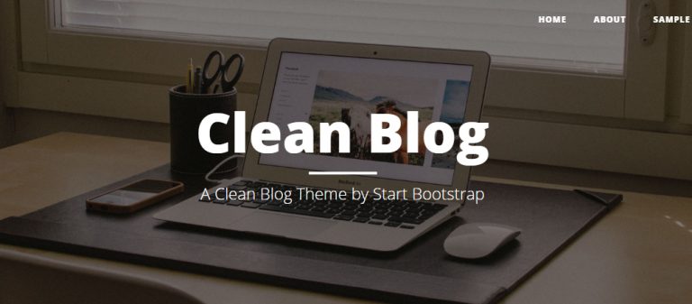
Sau khi hoàn thành Trang chủ, các bạn đã được một trang web khá hoàn chỉnh. Việc xây dựng các trang con khác sẽ rất nhanh chóng. Đây là cây thư mục hiện tại:
clean-blog/
├── css/
│   ├── main.css
├── img/
│   ├── favicon.ico
│   ├── home-bg.jpg
├── js/
│   ├── main.js
├── index.html
Trang bài viết
Bây giờ, hãy nhân bản index.html thành single.html. Sau đó cập nhật nội dung của title như sau:
<title>Sample Post | Clean Blog</title>Sau đó cập nhật nội dung HTML:
<header class="intro-header" style="background-image: url(https://blackrockdigital.github.io/startbootstrap-clean-blog/img/post-bg.jpg);">
    <nav class="navbar navbar-default navbar-custom navbar-static-top">
        <div class="container-fluid">
            <div class="navbar-header">
                <button type="button" class="navbar-toggle collapsed" data-toggle="collapse" data-target="#navbar" aria-expanded="false" aria-controls="navbar"> <span class="sr-only">Toggle navigation</span> <span class="icon-bar"></span> <span class="icon-bar"></span> <span class="icon-bar"></span> </button>
                <a class="navbar-brand" href="#">Start Bootstrap</a>
            </div>
            <div id="navbar" class="navbar-collapse collapse">
                <ul class="nav navbar-nav navbar-right">
                    <li><a href="index.html">Home</a></li>
                    <li><a href="about.html">About</a></li>
                    <li class="active"><a href="single.html">Sample Post</a></li>
                    <li><a href="contact.html">Contact</a></li>
                </ul>
            </div>
            <!--/.nav-collapse -->
        </div>
    </nav>
    <div class="container">
        <div class="row">
            <div class="col-lg-8 col-lg-offset-2 col-md-10 col-md-offset-1">
                <div class="site-heading post-heading">
                    <h1>Man must explore, and this is exploration at its greatest</h1>
                    <h2 class="subheading">Problems look mighty small from 150 miles up</h2>
                    <span class="meta">Posted by <a href="#">Start Bootstrap</a> on August 24, 2014</span>
                </div>
            </div>
        </div>
    </div>
</header>

<div class="container">
    <div class="row">
        <div class="col-lg-8 col-lg-offset-2 col-md-10 col-md-offset-1">
            <p>Never in all their history have men been able truly to conceive of the world as one: a single sphere, a globe, having the qualities of a globe, a round earth in which all the directions eventually meet, in which there is no center because every point, or none, is center — an equal earth which all men occupy as equals. The airman's earth, if free men make it, will be truly round: a globe in practice, not in theory.</p>
            <p>Science cuts two ways, of course; its products can be used for both good and evil. But there's no turning back from science. The early warnings about technological dangers also come from science.</p>
            <p>What was most significant about the lunar voyage was not that man set foot on the Moon but that they set eye on the earth.</p>
            <p>A Chinese tale tells of some men sent to harm a young girl who, upon seeing her beauty, become her protectors rather than her violators. That's how I felt seeing the Earth for the first time. I could not help but love and cherish her.</p>
            <p>For those who have seen the Earth from space, and for the hundreds and perhaps thousands more who will, the experience most certainly changes your perspective. The things that we share in our world are far more valuable than those which divide us.</p>
            <h2 class="section-heading">The Final Frontier</h2>
            <p>There can be no thought of finishing for ‘aiming for the stars.’ Both figuratively and literally, it is a task to occupy the generations. And no matter how much progress one makes, there is always the thrill of just beginning.</p>
            <p>There can be no thought of finishing for ‘aiming for the stars.’ Both figuratively and literally, it is a task to occupy the generations. And no matter how much progress one makes, there is always the thrill of just beginning.</p>
            <blockquote>The dreams of yesterday are the hopes of today and the reality of tomorrow. Science has not yet mastered prophecy. We predict too much for the next year and yet far too little for the next ten.</blockquote>
            <p>Spaceflights cannot be stopped. This is not the work of any one man or even a group of men. It is a historical process which mankind is carrying out in accordance with the natural laws of human development.</p>
            <h2 class="section-heading">Reaching for the Stars</h2>
            <p>As we got further and further away, it [the Earth] diminished in size. Finally it shrank to the size of a marble, the most beautiful you can imagine. That beautiful, warm, living object looked so fragile, so delicate, that if you touched it with a finger it would crumble and fall apart. Seeing this has to change a man.</p>
            <a href="#"> <img class="img-responsive" src="https://blackrockdigital.github.io/startbootstrap-clean-blog/img/post-sample-image.jpg" alt="Img"> </a> <span class="caption text-muted">To go places and do things that have never been done before – that’s what living is all about.</span>
            <p>Space, the final frontier. These are the voyages of the Starship Enterprise. Its five-year mission: to explore strange new worlds, to seek out new life and new civilizations, to boldly go where no man has gone before.</p>
            <p>As I stand out here in the wonders of the unknown at Hadley, I sort of realize there’s a fundamental truth to our nature, Man must explore, and this is exploration at its greatest.</p>
            <p>Placeholder text by <a href="http://spaceipsum.com/">Space Ipsum</a>. Photographs by <a href="https://www.flickr.com/photos/nasacommons/">NASA on The Commons</a>.</p>
        </div>
    </div>
</div>
CSS (main.css):
/* Trang bài viết */
.intro-header .post-heading h1 {
    font-size: 55px;
}

@media (max-width: 991px) {
    .intro-header .post-heading h1 {
        font-size: 35px;
    }
}

.intro-header .post-heading .sub-heading {
    font-size: 24px;
    margin: 10px 0 30px;
    font-weight: 400;
}

.intro-header .post-heading .meta {
    font-style: italic;
    font-weight: 300;
}

.intro-header .post-heading .meta a {
    color: #fff;
}

p {
    margin: 30px 0;
}

blockquote {
    color: #777;
    font-style: italic;
}

.section-heading {
  font-size: 36px;
  margin-top: 60px;
  font-weight: 700;
}

.caption {
  text-align: center;
  font-size: 14px;
  padding: 10px;
  font-style: italic;
  margin: 0;
  display: block;
  border-bottom-right-radius: 5px;
  border-bottom-left-radius: 5px;
}
Chỉ như vậy thôi chúng ta đã hoàn thành Trang bài viết.
Trang giới thiệu
Nhân bản single.html thành about.html, chỉ cần cập nhật lại title và HTML:
<title>About | Clean Blog</title>HTML:
<header class="intro-header" style="background-image: url(https://blackrockdigital.github.io/startbootstrap-clean-blog/img/about-bg.jpg);">
    <nav class="navbar navbar-default navbar-custom navbar-static-top">
        <div class="container-fluid">
            <div class="navbar-header">
                <button type="button" class="navbar-toggle collapsed" data-toggle="collapse" data-target="#navbar" aria-expanded="false" aria-controls="navbar"> <span class="sr-only">Toggle navigation</span> <span class="icon-bar"></span> <span class="icon-bar"></span> <span class="icon-bar"></span> </button>
                <a class="navbar-brand" href="#">Start Bootstrap</a>
            </div>
            <div id="navbar" class="navbar-collapse collapse">
                <ul class="nav navbar-nav navbar-right">
                    <li><a href="index.html">Home</a></li>
                    <li class="active"><a href="about.html">About</a></li>
                    <li><a href="single.html">Sample Post</a></li>
                    <li><a href="contact.html">Contact</a></li>
                </ul>
            </div>
            <!--/.nav-collapse -->
        </div>
    </nav>
    <div class="container">
        <div class="row">
            <div class="col-lg-8 col-lg-offset-2 col-md-10 col-md-offset-1">
                <div class="site-heading text-center">
                    <h1>About Me</h1>
                    <hr class="small">
                    <span class="sub-heading">This is what I do.</span>
                </div>
            </div>
        </div>
    </div>
</header>

<div class="container">
    <div class="row">
        <div class="col-lg-8 col-lg-offset-2 col-md-10 col-md-offset-1">
            <p>Lorem ipsum dolor sit amet, consectetur adipisicing elit. Saepe nostrum ullam eveniet pariatur voluptates odit, fuga atque ea nobis sit soluta odio, adipisci quas excepturi maxime quae totam ducimus consectetur?</p>
            <p>Lorem ipsum dolor sit amet, consectetur adipisicing elit. Eius praesentium recusandae illo eaque architecto error, repellendus iusto reprehenderit, doloribus, minus sunt. Numquam at quae voluptatum in officia voluptas voluptatibus, minus!</p>
            <p>Lorem ipsum dolor sit amet, consectetur adipisicing elit. Nostrum molestiae debitis nobis, quod sapiente qui voluptatum, placeat magni repudiandae accusantium fugit quas labore non rerum possimus, corrupti enim modi! Et.</p>
        </div>
    </div>
</div>
CSS được dùng chung với Trang bài viết.
Trang liên hệ
Nhân bản about.html thành contact.html, cập nhật lại title:
<title>Contact | Clean Blog</title>HTML:
<header class="intro-header" style="background-image: url(https://blackrockdigital.github.io/startbootstrap-clean-blog/img/about-bg.jpg);">
    <nav class="navbar navbar-default navbar-custom navbar-static-top">
        <div class="container-fluid">
            <div class="navbar-header">
                <button type="button" class="navbar-toggle collapsed" data-toggle="collapse" data-target="#navbar" aria-expanded="false" aria-controls="navbar"> <span class="sr-only">Toggle navigation</span> <span class="icon-bar"></span> <span class="icon-bar"></span> <span class="icon-bar"></span> </button>
                <a class="navbar-brand" href="#">Start Bootstrap</a>
            </div>
            <div id="navbar" class="navbar-collapse collapse">
                <ul class="nav navbar-nav navbar-right">
                    <li><a href="index.html">Home</a></li>
                    <li><a href="about.html">About</a></li>
                    <li><a href="single.html">Sample Post</a></li>
                    <li class="active"><a href="contact.html">Contact</a></li>
                </ul>
            </div>
            <!--/.nav-collapse -->
        </div>
    </nav>
    <div class="container">
        <div class="row">
            <div class="col-lg-8 col-lg-offset-2 col-md-10 col-md-offset-1">
                <div class="site-heading text-center">
                    <h1>Contact Me</h1>
                    <hr class="small">
                    <span class="sub-heading">Have questions? I have answers (maybe).</span>
                </div>
            </div>
        </div>
    </div>
</header>

<div class="container">
        <div class="row">
            <div class="col-lg-8 col-lg-offset-2 col-md-10 col-md-offset-1">
                <p>Want to get in touch with me? Fill out the form below to send me a message and I will try to get back to you within 24 hours!</p>
                <form>
                    <div class="row">
                        <div class="form-group col-xs-12 floating-label-form-group">
                            <label>Name</label>
                            <input type="text" class="form-control" placeholder="Name">
                            <p class="help-block text-danger"></p>
                        </div>
                    </div>
                    <div class="row">
                        <div class="form-group col-xs-12 floating-label-form-group">
                            <label>Email Address</label>
                            <input type="email" class="form-control" placeholder="Email Address">
                            <p class="help-block text-danger"></p>
                        </div>
                    </div>
                    <div class="row">
                        <div class="form-group col-xs-12 floating-label-form-group">
                            <label>Phone Number</label>
                            <input type="tel" class="form-control" placeholder="Phone Number">
                            <p class="help-block text-danger"></p>
                        </div>
                    </div>
                    <div class="row">
                        <div class="form-group col-xs-12 floating-label-form-group">
                            <label>Message</label>
                            <textarea rows="5" class="form-control" placeholder="Message"></textarea>
                            <p class="help-block text-danger"></p>
                        </div>
                    </div>
                    <br>
                    <div class="row">
                        <div class="form-group col-xs-12">
                            <button type="submit" class="btn btn-default">Send</button>
                        </div>
                    </div>
                </form>
            </div>
        </div>
    </div>
CSS (main.css):
/* Trang liên hệ */
.floating-label-form-group {
    font-size: 14px;
    position: relative;
    margin-bottom: 0;
    padding-bottom: 0.5em;
    border-bottom: 1px solid #eeeeee;
}

.floating-label-form-group input, .floating-label-form-group textarea {
    z-index: 1;
    position: relative;
    padding-right: 0;
    padding-left: 0;
    border: none;
    border-radius: 0;
    font-size: 1.5em;
    background: none;
    box-shadow: none !important;
    resize: none;
}

.floating-label-form-group label {
    display: block;
    z-index: 0;
    position: relative;
    top: 2em;
    margin: 0;
    font-size: 0.85em;
    line-height: 1.764705882em;
    vertical-align: middle;
    vertical-align: baseline;
    opacity: 0;
    -webkit-transition: top 0.3s ease, opacity 0.3s ease;
    -moz-transition: top 0.3s ease, opacity 0.3s ease;
    -ms-transition: top 0.3s ease, opacity 0.3s ease;
    transition: top 0.3s ease, opacity 0.3s ease;
}

.floating-label-form-group::not(:first-child) {
    padding-left: 14px;
    border-left: 1px solid #eeeeee;
}

.floating-label-form-group-with-value label {
    top: 0;
    opacity: 1;
}

.floating-label-form-group-with-focus label {
    color: #0085a1;
}

form .row:first-child .floating-label-form-group {
    border-top: 1px solid #eeeeee;
}

.btn {
    text-transform: uppercase;
    font-size: 14px;
    font-weight: 800;
    letter-spacing: 1px;
    border-radius: 0;
    padding: 15px 25px;
}

.btn-lg {
    font-size: 16px;
    padding: 25px 35px;
}

.btn-default:hover, .btn-default:focus {
    background-color: #0085a1;
    border: 1px solid #0085a1;
    color: #fff;
}
Vậy là chúng ta đã hoàn thành dự án Blog cá nhân, các bạn có thể tải về tại đây để so sánh kết quả. Dự án gồm:
clean-blog/
├── css/
│   ├── main.css
├── img/
│   ├── favicon.ico
│   ├── home-bg.jpg
├── js/
│   ├── main.js
├── about.html
├── contact.html
├── index.html
├── single.htmlNhững gì học được:
- Nhúng Google Fonts vào website.
- Nhúng Font Awesome vào website.
- Sử dụng Bootstrap: navbar, pager, chia cột…
- Một Blog cá nhân cơ bản.


Bình luận