- Những gì bạn cần để hoàn thành hướng dẫn này
- Tạo hình tròn
- Tạo hình vuông
- Tạo hình chữ nhật
- Tạo hình Oval
- Tạo hình tam giác
- Tạo hình tam giác hướng xuống
- Tạo tam giác hướng qua trái
- Tạo tam giác hướng qua phải
- Tạo khối kim cương
- Tạo hình thang
- Tạo hình bình hành
- Tạo ngôi sao
- Tạo ngôi sao 6 cánh
- Tạo hình ngũ giác
- Tạo hình lục giác
- Tạo hình bát giác
- Tạo hình trái tim
- Tạo hình quả trứng
- Tạo biểu tượng vô cực
- Tạo bong bóng bình luận
- Tạo biểu tượng Pacman
- Kết
Những gì bạn cần để hoàn thành hướng dẫn này
- Kiến thức về CSS3.
- Thời gian và sự kiên nhẫn.
Tạo hình tròn
HTML
Để tạo hình tròn, đầu tiên chúng ta cần một thẻ div có ID là tên của hình khối cần tạo. Ví dụ ở đây, đặt circle là tên ID.
<div id="circle"></div>CSS
Ở phần CSS, đặt width, height (bằng nhau để có hình vuông) với border-radius bằng 1/2 chiều cao và chiều rộng.
#circle {
    width: 120px;
    height: 120px;
    background: #7fee1d;
    -moz-border-radius: 60px;
    -webkit-border-radius: 60px;
    border-radius: 60px;
}
Tạo hình vuông
HTML
Tương tự như hình tròn, đặt ID cho div là square.
<div id="square"></div>CSS
CSS chỉ đơn giản là width và height bằng nhau.
#square {
    width: 120px;
    height: 120px;
    background: #f447ff;
}
Tạo hình chữ nhật
HTML
Tương tự hình trên.
<div id="rectangle"></div>CSS
CSS sẽ như sau.
#rectangle {
    width: 220px;
    height: 120px;
    background: #4da1f7;
}
Tạo hình Oval
HTML
Tương tự hình trên.
<div id="oval"></div>CSS
CSS sẽ như sau.
#oval {
    width: 200px;
    height: 100px;
    background: #e9337c;
    -webkit-border-radius: 100px / 50px;
    -moz-border-radius: 100px / 50px;
    border-radius: 100px / 50px;
}
Tạo hình tam giác
HTML
Tương tự hình trên.
<div id="triangle"></div>CSS
CSS sẽ như sau.
#triangle {
    width: 0;
    height: 0;
    border-bottom: 140px solid #fcf921;
    border-left: 70px solid transparent;
    border-right: 70px solid transparent;
}
Tạo hình tam giác hướng xuống
HTML
Tương tự hình trên.
<div id="triangle_down"></div>CSS
CSS sẽ như sau.
#triangle_down {
    width: 0;
    height: 0;
    border-top: 140px solid #20a3bf;
    border-left: 70px solid transparent;
    border-right: 70px solid transparent;
}
Tạo tam giác hướng qua trái
HTML
Tương tự hình trên.
<div id="triangle_left"></div>CSS
CSS sẽ như sau.
#triangle_left {
    width: 0;
    height: 0;
    border-top: 70px solid transparent;
    border-right: 140px solid #6bbf20;
    border-bottom: 70px solid transparent;
}
Tạo tam giác hướng qua phải
HTML
Tương tự hình trên.
<div id="triangle_right"></div>CSS
CSS sẽ như sau.
#triangle_right {
    width: 0;
    height: 0;
    border-top: 70px solid transparent;
    border-left: 140px solid #ff5a00;
    border-bottom: 70px solid transparent;
}
Tạo khối kim cương
HTML
Tương tự hình trên.
<div id="diamond"></div>CSS
CSS sẽ như sau.
#diamond {
    width: 120px;
    height: 120px;
    background: #1eff00;
/* Rotate */
    -webkit-transform: rotate(-45deg);
    -moz-transform: rotate(-45deg);
    -ms-transform: rotate(-45deg);
    -o-transform: rotate(-45deg);
    transform: rotate(-45deg);
/* Rotate Origin */
    -webkit-transform-origin: 0 100%;
    -moz-transform-origin: 0 100%;
    -ms-transform-origin: 0 100%;
    -o-transform-origin: 0 100%;
    transform-origin: 0 100%;
    margin: 60px 0 10px 310px;
}
Tạo hình thang
HTML
Tương tự hình trên.
<div id="trapezium"></div>CSS
CSS sẽ như sau.
#trapezium {
    height: 0;
    width: 120px;
    border-bottom: 120px solid #ec3504;
    border-left: 60px solid transparent;
    border-right: 60px solid transparent;
}
Tạo hình bình hành
HTML
Tương tự hình trên.
<div id="parallelogram"></div>CSS
CSS sẽ như sau.
#parallelogram {
    width: 160px;
    height: 100px;
    background: #8734f7;
    -webkit-transform: skew(30deg);
    -moz-transform: skew(30deg);
    -o-transform: skew(30deg);
    transform: skew(30deg);
}
Tạo ngôi sao
HTML
Tương tự hình trên.
<div id="star"></div>CSS
CSS sẽ như sau.
#star {
    width: 0;
    height: 0;
    margin: 50px 0;
    color: #fc2e5a;
    position: relative;
    display: block;
    border-right: 100px solid transparent;
    border-bottom: 70px solid #fc2e5a;
    border-left: 100px solid transparent;
    -moz-transform: rotate(35deg);
    -webkit-transform: rotate(35deg);
    -ms-transform: rotate(35deg);
    -o-transform: rotate(35deg);
}

#star:before {
    height: 0;
    width: 0;
    position: absolute;
    display: block;
    top: -45px;
    left: -65px;
    border-bottom: 80px solid #fc2e5a;
    border-left: 30px solid transparent;
    border-right: 30px solid transparent;
    content: '';
    -webkit-transform: rotate(-35deg);
    -moz-transform: rotate(-35deg);
    -ms-transform: rotate(-35deg);
    -o-transform: rotate(-35deg);
}

#star:after {
    content: '';
    width: 0;
    height: 0;
    position: absolute;
    display: block;
    top: 3px;
    left: -105px;
    color: #fc2e5a;
    border-right: 100px solid transparent;
    border-bottom: 70px solid #fc2e5a;
    border-left: 100px solid transparent;
    -webkit-transform: rotate(-70deg);
    -moz-transform: rotate(-70deg);
    -ms-transform: rotate(-70deg);
    -o-transform: rotate(-70deg);
}
Tạo ngôi sao 6 cánh
HTML
Tương tự hình trên.
<div id="star_six_points"></div>CSS
CSS sẽ như sau.
#star_six_points {
    width: 0;
    height: 0;
    display: block;
    position: absolute;
    border-left: 50px solid transparent;
    border-right: 50px solid transparent;
    border-bottom: 100px solid #de34f7;
    margin: 10px auto;
}

#star_six_points:after {
    content: "";
    width: 0;
    height: 0;
    position: absolute;
    border-left: 50px solid transparent;
    border-right: 50px solid transparent;
    border-top: 100px solid #de34f7;
    margin: 30px 0 0 -50px;
}
Tạo hình ngũ giác
HTML
Tương tự hình trên.
<div id="pentagon"></div>CSS
CSS sẽ như sau.
#pentagon {
    width: 54px;
    position: relative;
    border-width: 50px 18px 0;
    border-style: solid;
    border-color: #277bab transparent;
}

#pentagon:before {
    content: "";
    height: 0;
    width: 0;
    position: absolute;
    top: -85px;
    left: -18px;
    border-width: 0 45px 35px;
    border-style: solid;
    border-color: transparent transparent #277bab;
}
Tạo hình lục giác
HTML
Tương tự hình trên.
<div id="hexagon"></div>CSS
CSS sẽ như sau.
#hexagon {
    width: 100px;
    height: 55px;
    background: #fc5e5e;
    position: relative;
    margin: 10px auto;
}

#hexagon:before {
    content: "";
    width: 0;
    height: 0;
    position: absolute;
    top: -25px;
    left: 0;
    border-left: 50px solid transparent;
    border-right: 50px solid transparent;
    border-bottom: 25px solid #fc5e5e;
}

#hexagon:after {
    content: "";
    width: 0;
    height: 0;
    position: absolute;
    bottom: -25px;
    left: 0;
    border-left: 50px solid transparent;
    border-right: 50px solid transparent;
    border-top: 25px solid #fc5e5e;
}
Tạo hình bát giác
HTML
Tương tự hình trên.
<div id="octagon"></div>CSS
CSS sẽ như sau.
#octagon {
    width: 100px;
    height: 100px;
    background: #ac60ec;
    position: relative;
}

#octagon:before {
    content: "";
    width: 42px;
    height: 0;
    position: absolute;
    top: 0;
    left: 0;
    border-bottom: 29px solid #ac60ec;
    border-left: 29px solid #f4f4f4;
    border-right: 29px solid #f4f4f4;
}

#octagon:after {
    content: "";
    width: 42px;
    height: 0;
    position: absolute;
    bottom: 0;
    left: 0;
    border-top: 29px solid #ac60ec;
    border-left: 29px solid #f4f4f4;
    border-right: 29px solid #f4f4f4;
}
Tạo hình trái tim
HTML
Tương tự hình trên.
<div id="heart"></div>CSS
CSS sẽ như sau.
#heart {
    position: relative;
}

#heart:before,#heart:after {
    content: "";
    width: 70px;
    height: 115px;
    position: absolute;
    background: red;
    left: 70px;
    top: 0;
    -webkit-border-radius: 50px 50px 0 0;
    -moz-border-radius: 50px 50px 0 0;
    border-radius: 50px 50px 0 0;
    -webkit-transform: rotate(-45deg);
    -moz-transform: rotate(-45deg);
    -ms-transform: rotate(-45deg);
    -o-transform: rotate(-45deg);
    transform: rotate(-45deg);
    -webkit-transform-origin: 0 100%;
    -moz-transform-origin: 0 100%;
    -ms-transform-origin: 0 100%;
    -o-transform-origin: 0 100%;
    transform-origin: 0 100%;
}

#heart:after {
    left: 0;
    -webkit-transform: rotate(45deg);
    -moz-transform: rotate(45deg);
    -ms-transform: rotate(45deg);
    -o-transform: rotate(45deg);
    transform: rotate(45deg);
    -webkit-transform-origin: 100% 100%;
    -moz-transform-origin: 100% 100%;
    -ms-transform-origin: 100% 100%;
    -o-transform-origin: 100% 100%;
    transform-origin: 100% 100%;
}
Tạo hình quả trứng
HTML
Tương tự hình trên.
<div id="egg"></div>CSS
CSS sẽ như sau.
#egg {
    width: 136px;
    height: 190px;
    background: #ffc000;
    display: block;
    -webkit-border-radius: 63px 63px 63px 63px / 108px 108px 72px 72px;
    border-radius: 50% 50% 50% 50% / 60% 60% 40% 40%;
}
Tạo biểu tượng vô cực
HTML
Tương tự hình trên.
<div id="infinity"></div>CSS
CSS sẽ như sau.
#infinity {
    width: 220px;
    height: 100px;
    position: relative;
}

#infinity:before,#infinity:after {
    content: "";
    width: 60px;
    height: 60px;
    position: absolute;
    top: 0;
    left: 0;
    border: 20px solid #06c999;
    -moz-border-radius: 50px 50px 0;
    border-radius: 50px 50px 0 50px;
    -webkit-transform: rotate(-45deg);
    -moz-transform: rotate(-45deg);
    -ms-transform: rotate(-45deg);
    -o-transform: rotate(-45deg);
    transform: rotate(-45deg);
}

#infinity:after {
    left: auto;
    right: 0;
    -moz-border-radius: 50px 50px 50px 0;
    border-radius: 50px 50px 50px 0;
    -webkit-transform: rotate(45deg);
    -moz-transform: rotate(45deg);
    -ms-transform: rotate(45deg);
    -o-transform: rotate(45deg);
    transform: rotate(45deg);
}
Tạo bong bóng bình luận
HTML
Tương tự hình trên.
<div id="comment_bubble"></div>CSS
CSS sẽ như sau.
#comment_bubble {
    width: 140px;
    height: 100px;
    background: #088cb7;
    position: relative;
    -moz-border-radius: 12px;
    -webkit-border-radius: 12px;
    border-radius: 12px;
}

#comment_bubble:before {
    content: "";
    width: 0;
    height: 0;
    right: 100%;
    top: 38px;
    position: absolute;
    border-top: 13px solid transparent;
    border-right: 26px solid #088cb7;
    border-bottom: 13px solid transparent;
}
Tạo biểu tượng Pacman
HTML
Tương tự hình trên.
<div id="pacman"></div>CSS
CSS sẽ như sau.
#pacman {
    width: 0;
    height: 0;
    border-right: 70px solid transparent;
    border-top: 70px solid #ffde00;
    border-left: 70px solid #ffde00;
    border-bottom: 70px solid #ffde00;
    border-top-left-radius: 70px;
    border-top-right-radius: 70px;
    border-bottom-left-radius: 70px;
    border-bottom-right-radius: 70px;
}
Kết
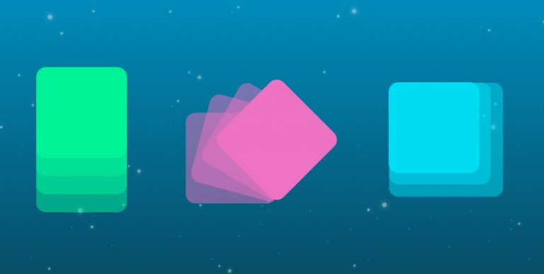
Bên trên là rất nhiều cách tạo hình khối với CSS3 thay cho hình ảnh trên website để giảm bớt request và dung lượng tải xuống, vì ngày nay hầu hết trình duyệt đều hỗ trợ CSS3.


Bình luận